Visualising Stage Surfaces#
The stages data provides information about stage surface types, both as percentages of each surface type per stage, as well as a breakdown of surface type for different sections of each stage.
Each stage is also split into sectors, where the sector represents the lengths of liaison stages associated with a competitive stage, as well the competitive stage sector information.
# Load in required packages
import seaborn as sns
import matplotlib.pyplot as plt

#%matplotlib inline
from dakar_rallydj.getter import DakarAPIClient

dakar = DakarAPIClient(
    use_cache=True,
    backend='memory',
    # cache_name='dakar_cache',
    expire_after=3600  # Cache for 1 hour
)
# Load in the data from the Dakar live data site

stages_df, sectors_df, stage_surfaces_df, section_surfaces_df, surfaces_df = dakar.get_stages()
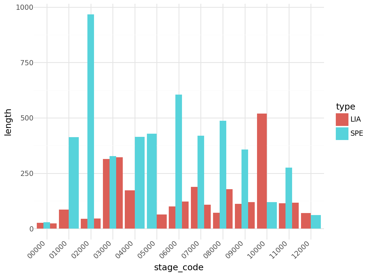
Liaison stage details#
Provide a quick overview of the lengths of liaison stages associated with each competitive stage.
# Rename the 0P000 stage to 00000 to make a simpler sort...
sectors_df.loc[sectors_df['code'].str.startswith('0P'), 'stage_code'] = '00000'

sectors_df.sort_values(["stage_code", "sector_number"], inplace=True)
sectors_df.reset_index(drop=True, inplace=True)

sectors_df[["stage_code", "code", "sector_number", "length", "type"]].head()
| stage_code | code | sector_number | length | type | |
|---|---|---|---|---|---|
| 0 | 00000 | 0P100 | 1 | 26 | LIA |
| 1 | 00000 | 0P200 | 2 | 29 | SPE |
| 2 | 00000 | 0P300 | 3 | 24 | LIA |
| 3 | 01000 | 01100 | 1 | 86 | LIA |
| 4 | 01000 | 01200 | 2 | 413 | SPE |
from plotnine import ggplot, aes, geom_bar, theme_minimal, theme, element_text

(
    ggplot(sectors_df, aes(x='stage_code', y='length', fill='type'))
    + geom_bar(stat='identity', position='dodge')  # dodge groups bars
    + theme_minimal()
    + aes(group='sector_number')  # grouping by stage
    + theme(axis_text_x=element_text(angle=45, hjust=1))
)
Percentage distribution of surfaces#
Let’s start by looking at a dodged bar chart of showing the surface type as a percentage of the length of each stage.
stage_surfaces_df.head()
| code | percentage | color | type | |
|---|---|---|---|---|
| 0 | 01200 | 18 | #753a05 | dirt track |
| 1 | 01200 | 18 | #753a05 | dirt track |
| 2 | 01200 | 28 | #1dc942 | gravel track |
| 3 | 01200 | 53 | #efc07c | sand |
| 4 | 01200 | 18 | #753a05 | dirt track |
# Mapping types to colors
type_color_map = dict(
    zip(stage_surfaces_df['type'], stage_surfaces_df['color']))

# Create the plot
plt.figure(figsize=(10, 6))

sns.barplot(
    data=stage_surfaces_df,
    x="code",
    y="percentage",
    hue="type",
    palette=type_color_map
)

# Adjust labels and title
plt.title("Dodged Bar Chart by Code and Type")
plt.xlabel("Code")
plt.ylabel("Percentage")
plt.legend(title="Type")
plt.show()
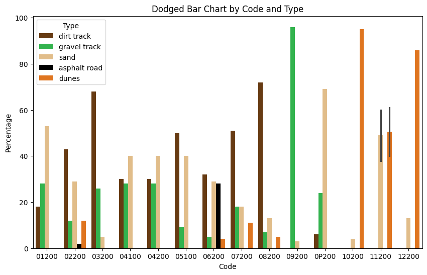
It looks like the data for stage 4 may be incorrectly mapped onto the liason sector as well as the competitive stage? We could filter that out by checking the sector code maps to a SPE sector type in the sectors_df dataframe.
There is also something strange going on in stage 11 (code 11200) — it looks as if we are averaging multiple values?
stage_surfaces_df[stage_surfaces_df["code"]=="11200"]
| code | percentage | color | type | |
|---|---|---|---|---|
| 121 | 11200 | 60 | #efc07c | sand |
| 122 | 11200 | 40 | #ff7200 | dunes |
| 123 | 11200 | 38 | #efc07c | sand |
| 124 | 11200 | 61 | #ff7200 | dunes |
Ah, it looks like the values may have been incorrectly entered: but which are the correct values?
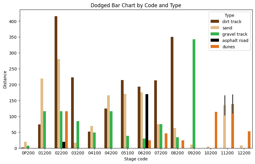
In terms of distance, what distance is associated with each surface type on each stage?
To find that, we need to multiply the percentage by the distance.
import pandas as pd

stage_surfaces_df = pd.merge(
    sectors_df[["code", "length"]], stage_surfaces_df, on="code")
stage_surfaces_df["distance"] = stage_surfaces_df["length"] * \
    stage_surfaces_df["percentage"]/100

stage_surfaces_df.head()
| code | length | percentage | color | type | distance | |
|---|---|---|---|---|---|---|
| 0 | 0P200 | 29 | 6 | #753a05 | dirt track | 1.74 |
| 1 | 0P200 | 29 | 69 | #efc07c | sand | 20.01 |
| 2 | 0P200 | 29 | 24 | #1dc942 | gravel track | 6.96 |
| 3 | 0P200 | 29 | 69 | #efc07c | sand | 20.01 |
| 4 | 0P200 | 29 | 6 | #753a05 | dirt track | 1.74 |
# Create the plot
plt.figure(figsize=(10, 6))

sns.barplot(
    data=stage_surfaces_df,
    x="code",
    y="distance",
    hue="type",
    palette=type_color_map
)

# Adjust labels and title
plt.title("Dodged Bar Chart by Code and Type")
plt.xlabel("Stage code")
plt.ylabel("Distance")
plt.legend(title="Type")
plt.show()
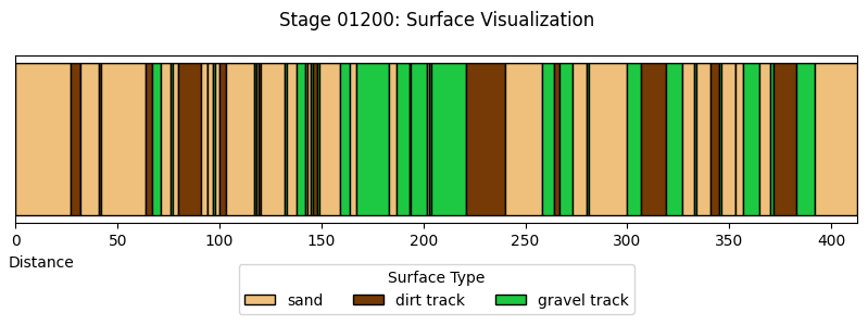
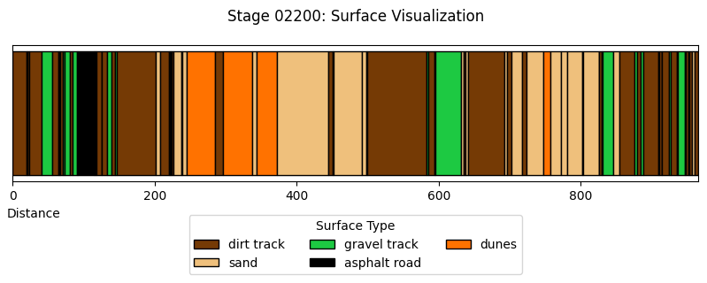
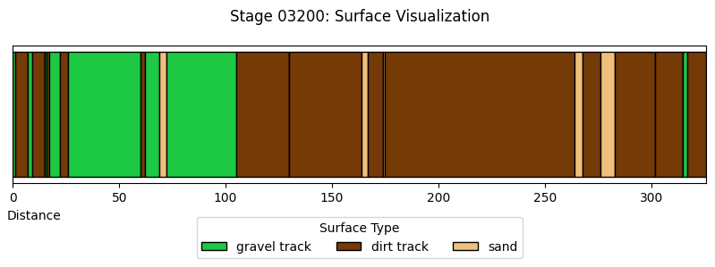
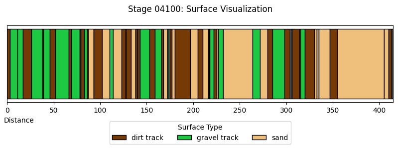
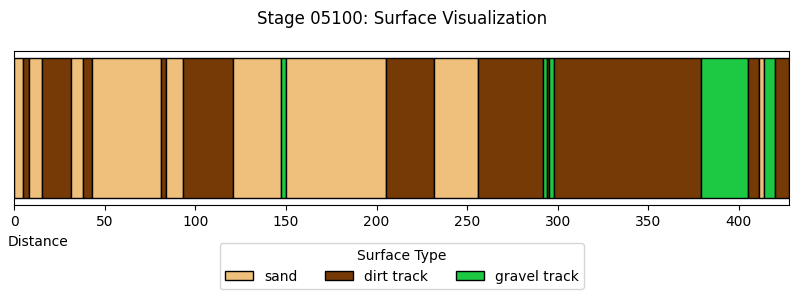
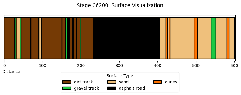
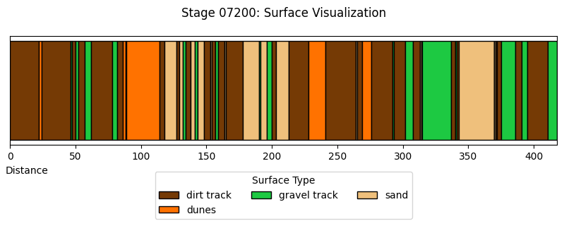
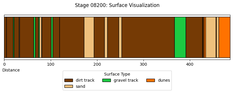
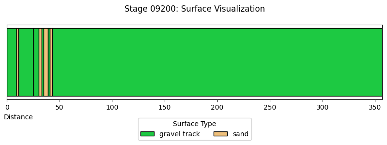
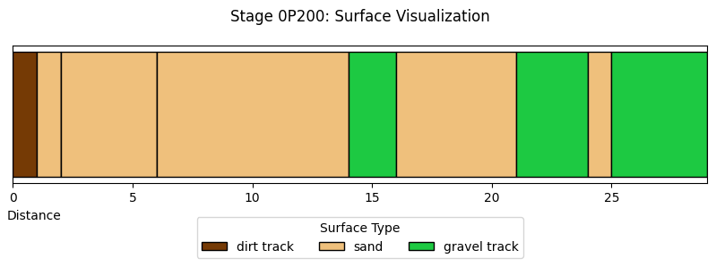
Stage Section Surfaces#
Each competitive stage is split into several sections, of different surface types. For each stage, visualise the stage by section surface type.
section_surfaces_df.head()
| code | section | start | finish | color | type | |
|---|---|---|---|---|---|---|
| 0 | 01200 | 1 | 0 | 27 | #efc07c | sand |
| 1 | 01200 | 2 | 27 | 32 | #753a05 | dirt track |
| 2 | 01200 | 3 | 32 | 32 | #1dc942 | gravel track |
| 3 | 01200 | 4 | 32 | 41 | #efc07c | sand |
| 4 | 01200 | 5 | 41 | 42 | #753a05 | dirt track |
def plot_section_surface_chart(stage_code):
    # Filter data for the selected stage code
    stage_df = section_surfaces_df[section_surfaces_df['code']
                                   == stage_code].sort_values(by='start')

    #CLear plot object
    plt.clf()

    # Create the figure and axis
    fig, ax = plt.subplots(figsize=(10, 2))


    # Plot each section as a horizontal bar
    for _, row in stage_df.iterrows():
        ax.barh(
            y=0,  # Single row
            width=row['finish'] - row['start'],  # Bar width is finish - start
            left=row['start'],  # Start position of the bar
            color=row['color'],  # Color based on surface type
            edgecolor='black',
            label=row['type']  # Label for legend
        )

    # Add legend (only unique types)
    handles, labels = ax.get_legend_handles_labels()
    by_label = dict(zip(labels, handles))
    ax.legend(by_label.values(), by_label.keys(), title="Surface Type",
              loc="upper center", bbox_to_anchor=(0.5, -0.2), ncol=3)

    # Set title and axis labels
    ax.set_title(f"Stage {stage_code}: Surface Visualization", pad=20)
    ax.set_xlabel("Distance", x=0.03)
    ax.set_yticks([])  # Hide y-axis ticks as it's a single row
    # Adjust x-axis limit to max finish value
    ax.set_xlim(
        0, section_surfaces_df[section_surfaces_df['code'] == stage_code]['finish'].max())

    # Show the plot
    #plt.tight_layout()
    plt.show()
    plt.close();


plot_section_surface_chart("04200")
<Figure size 640x480 with 0 Axes>

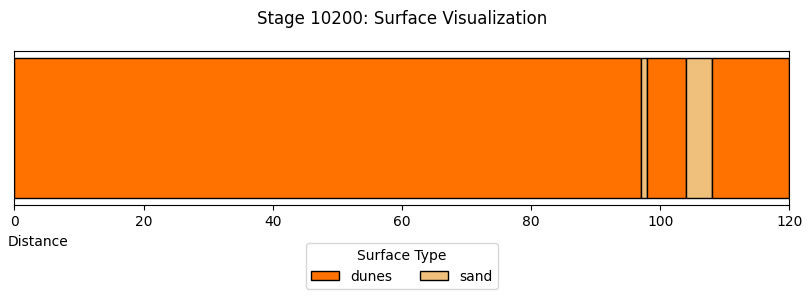
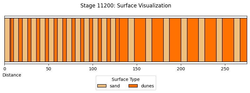
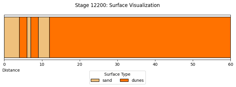
def plot_stage(stage_data):
    """
    Plot a single stage's surface visualization.
    """
    # Extract the stage code
    stage_code = stage_data['code'].iloc[0]

    # Create the figure and axis
    fig, ax = plt.subplots(figsize=(10, 2))

    # Plot each section as a horizontal bar using apply
    stage_data.apply(
        lambda row: ax.barh(
            y=0,  # Single row
            width=row['finish'] - row['start'],  # Bar width is finish - start
            left=row['start'],  # Start position of the bar
            color=row['color'],  # Color based on surface type
            edgecolor='black',
            label=row['type']  # Label for legend
        ), axis=1
    )

    # Add legend (only unique types)
    handles, labels = ax.get_legend_handles_labels()
    by_label = dict(zip(labels, handles))
    ax.legend(by_label.values(), by_label.keys(), title="Surface Type",
              loc="upper center", bbox_to_anchor=(0.5, -0.2), ncol=3)

    # Set title and axis labels
    ax.set_title(f"Stage {stage_code}: Surface Visualization", pad=20)
    ax.set_xlabel("Distance", x=0.03)
    ax.set_yticks([])  # Hide y-axis ticks as it's a single row
    # Adjust x-axis limit to max finish value
    ax.set_xlim(0, stage_data['finish'].max())

    # Show the plot
    #plt.tight_layout()
    plt.show()
    plt.close();


# Group by 'code' and plot each stage
section_surfaces_df.groupby('code')[section_surfaces_df.columns].apply(plot_stage);
Stage Surface Dashboard#
We can use the ipywidgets framework to provide us with simple dropdown menu controls to select stages and the percentage or distance associated with each surface type and then display a surface type chart for just that stage.
In the HTML book version of this notebook, the dropdown widgets are rendered but the charts are not “live” and will not be updated; ideally, we would integrate something like Thebe-lite so that these charts could be updated as live within the HTML book context.
from ipywidgets import interact, widgets

plt.figure(figsize=(10, 6))

def plot_stage_surface_chart(selected_code, typ):
    plt.clf()

    # Filter the DataFrame for the selected code
    filtered_df = stage_surfaces_df[stage_surfaces_df['code'] == selected_code]

    # Create the plot (remove plt.figure() call)
    sns.barplot(
        data=filtered_df,
        x="type",
        y=typ,
        palette=type_color_map,
        hue="type",
        legend=False
    )

    # Adjust labels and title
    plt.title(f"Dodged Bar Chart for Code {selected_code}")
    plt.xlabel("Surface type")
    plt.ylabel(f"{typ.capitalize()}")
    plt.xticks(rotation=45)
    plt.show()
    plt.close();

# Create dropdown widget
code_dropdown = widgets.Dropdown(
    options=stage_surfaces_df['code'].unique(),
    description='Code:',
    value=stage_surfaces_df['code'].unique()[0]
)

typ_dropdown = widgets.Dropdown(
    options=['percentage', 'distance'],  # Add options for Y-axis
    description='Y-axis:',
    value='percentage')

# Interactive plot
interact(plot_stage_surface_chart,
         selected_code=code_dropdown, typ=typ_dropdown);
# Create dropdown widget
code_dropdown2 = widgets.Dropdown(
    options=stage_surfaces_df['code'].unique(),
    description='Code:',
    value=stage_surfaces_df['code'].unique()[0]
)

_ = interact(plot_section_surface_chart,
         stage_code=code_dropdown2);