Visualising Withdrawals#
The withdrawals data provides lists competitors who have withdrawn on a particular stage. Perhaps the simplest visualisation is a simple interactive that lets us select a stage and then display the comperitors who withdraw on that stage. An extra all option allows us to display all the withdrawals.
from dakar_rallydj.getter import DakarAPIClient

dakar = DakarAPIClient(
    use_cache=True,
    backend='memory',
    # cache_name='dakar_cache',
    expire_after=3600  # Cache for 1 hour
)
# Optionally specify category (A. F, K, M)
withdrawals_df, withdrawn_competitors_df, withdrawn_teams_df = dakar.get_withdrawals()
One of the things we note from the withdrawals data is that we don’t know what classes the withdrawals relate to:
withdrawals_df.head()
| stage | bib | reason | _category | |
|---|---|---|---|---|
| 0 | 2 | 223 | 1 | A |
| 1 | 3 | 225 | 1 | A |
| 2 | 3 | 306 | 1 | A |
| 3 | 3 | 313 | 1 | A |
| 4 | 3 | 355 | 1 | A |
So let’s add in some additional metadata so we can filter on classes:
from dakar_rallydj.enrichers import derive_clazz_metadata

groups_df = dakar.get_groups()
clazz_df = dakar.get_clazz()

clazz_metadata_df = derive_clazz_metadata(withdrawn_teams_df, clazz_df, groups_df)

clazz_metadata_df.head()
| team.bib | reference | categoryClazz | clazz_label | tinyLabel | label | color | group_label | |
|---|---|---|---|---|---|---|---|---|
| 0 | 202 | 2025-A-T1-+ | 2025-A-T1 | T1+: Prototype Cross-Country Cars 4x4 | ULT | T1 | #EBBC4E | Ultimate |
| 1 | 205 | 2025-A-T1-+ | 2025-A-T1 | T1+: Prototype Cross-Country Cars 4x4 | ULT | T1 | #EBBC4E | Ultimate |
| 2 | 206 | 2025-A-T1-+ | 2025-A-T1 | T1+: Prototype Cross-Country Cars 4x4 | ULT | T1 | #EBBC4E | Ultimate |
| 3 | 208 | 2025-A-T1-+ | 2025-A-T1 | T1+: Prototype Cross-Country Cars 4x4 | ULT | T1 | #EBBC4E | Ultimate |
| 4 | 213 | 2025-A-T1-2 | 2025-A-T1 | T1.2 Prototype Cross-Country Cars 4x2 | ULT | T1 | #EBBC4E | Ultimate |
clazz_metadata_df["tinyLabel"].unique()
array(['ULT', 'CHG', 'SSV', 'TRK'], dtype=object)
We can now merge the withdrawal table with the metadata table:
import pandas as pd

withdrawals_df = pd.merge(withdrawals_df, clazz_metadata_df.rename(columns={"team.bib":"bib"}), on="bib")

withdrawals_df.head()
| stage | bib | reason | _category | reference | categoryClazz | clazz_label | tinyLabel | label | color | group_label | |
|---|---|---|---|---|---|---|---|---|---|---|---|
| 0 | 2 | 223 | 1 | A | 2025-A-T1-2 | 2025-A-T1 | T1.2 Prototype Cross-Country Cars 4x2 | ULT | T1 | #EBBC4E | Ultimate |
| 1 | 3 | 225 | 1 | A | 2025-A-T1-+ | 2025-A-T1 | T1+: Prototype Cross-Country Cars 4x4 | ULT | T1 | #EBBC4E | Ultimate |
| 2 | 3 | 306 | 1 | A | 2025-A-T3-1 | 2025-A-T3 | T3.1: Lightweight Prototype Cross-Country | CHG | T3 | #E04E39 | Challenger |
| 3 | 3 | 313 | 1 | A | 2025-A-T3-1 | 2025-A-T3 | T3.1: Lightweight Prototype Cross-Country | CHG | T3 | #E04E39 | Challenger |
| 4 | 3 | 355 | 1 | A | 2025-A-T3-1 | 2025-A-T3 | T3.1: Lightweight Prototype Cross-Country | CHG | T3 | #E04E39 | Challenger |
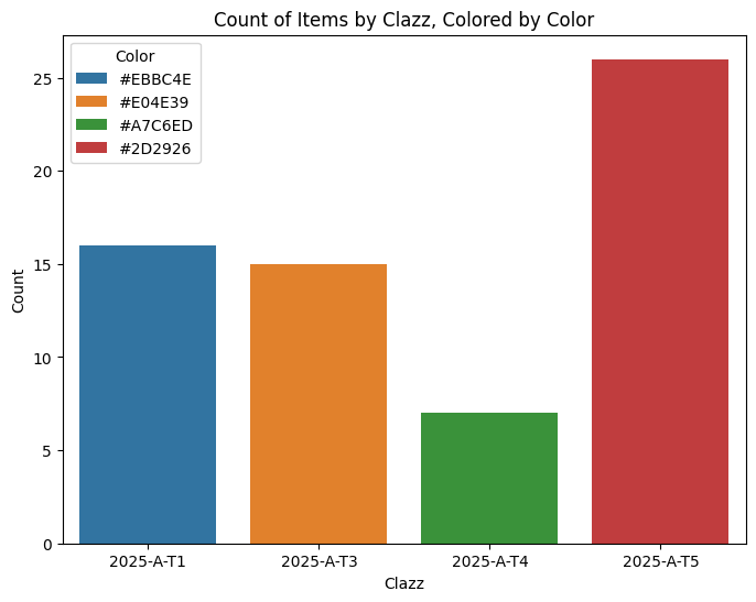
We can do some counting to analyse withdrawals by category:
import seaborn as sns
import matplotlib.pyplot as plt

plt.figure(figsize=(8, 6))
sns.countplot(data=withdrawals_df, x="categoryClazz",
              hue="color")

# Add labels and title
plt.xlabel("Clazz")
plt.ylabel("Count")
plt.title("Count of Items by Clazz, Colored by Color")

# Show plot
plt.legend(title="Color");
But that doesn’t play nicely with the colour mapping. To get better control over the colours, we can use a Grammar of Graphics approach:
from plotnine import ggplot, aes, geom_bar, theme_minimal, labs, theme, scale_fill_manual

color_map = dict(
    zip(withdrawals_df['tinyLabel'].unique(), withdrawals_df['color'].unique()))


g = (
    ggplot(withdrawals_df, aes(x="tinyLabel", fill="tinyLabel"))
    + geom_bar()
    + theme_minimal()
    + labs(
        title="Withdrawals by Category",
        x="Class",
        y="Count",
        fill="Color"
    )
    + scale_fill_manual(values=color_map)
    + theme(legend_position='none')
)

g
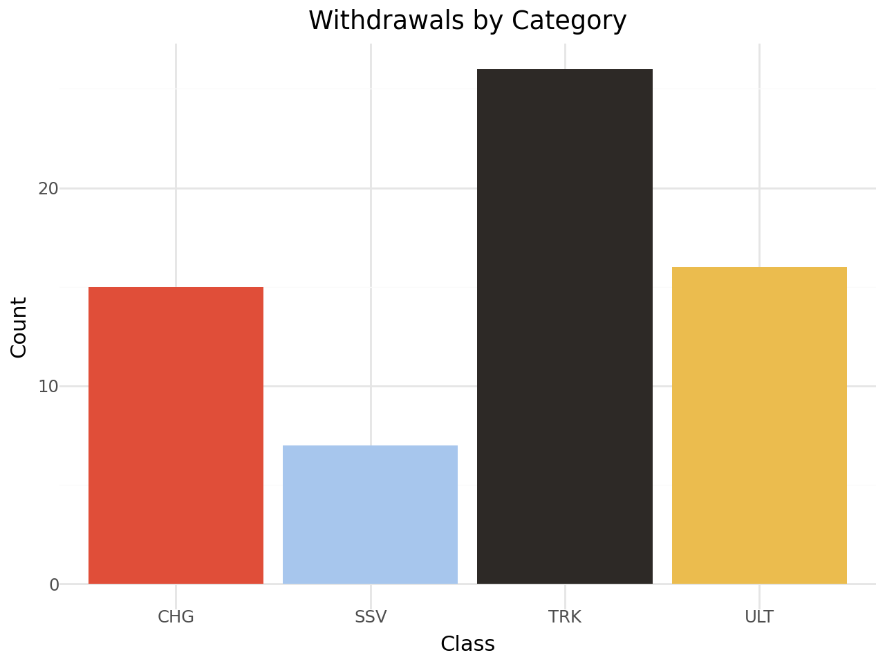
Recall that these results are just for the specified categories, and by default we have only loaded in data for the auto (A) category.
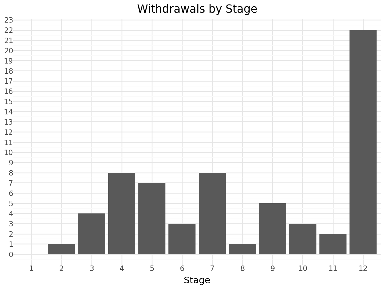
How about withdrawals by stage?
from plotnine import scale_x_discrete, scale_y_continuous

(
    ggplot(withdrawals_df, aes(x='stage'))
    # Dodge groups bars
    # We also want the bars to have a preserved width
    + geom_bar()
    + theme_minimal()
    + scale_x_discrete(
        # Treat 'stage' as a categorical variable
        # while keeping the order of integers
        # Ensure 'stage' is treated in order
        limits=sorted(range(1, withdrawals_df['stage'].max()+1))
    )
    + scale_y_continuous(
        # Force integer ticks for the y-axis
        breaks=lambda l: range(0, int(l[-1])+1, 1)
    )
    + theme_minimal()
    + labs(
        title="Withdrawals by Stage",
        x="Stage",
        y="",
        fill="Class"
    )
)
Or withdrawals by stage and class?
(
    ggplot(withdrawals_df, aes(x='stage', fill='tinyLabel', group='tinyLabel'))
    # Stack group bars
    + geom_bar(position='stack')
    + theme_minimal()
    + scale_x_discrete(
        # Treat 'stage' as a categorical variable
        # while keeping the order of integers
        # Ensure 'stage' is treated in order
        limits=sorted(range(1, withdrawals_df['stage'].max()+1))
    )
    # The color is given in the data
    + scale_fill_manual(values=color_map)
    + scale_y_continuous(
        # Force integer ticks for the y-axis
        breaks=lambda l: range(0, int(l[-1])+1, 1)
    )
    + theme_minimal()
    + labs(
        title="Withdrawals by Stage and Class",
        x="Stage",
        y="",
        fill="Class"
    )
)
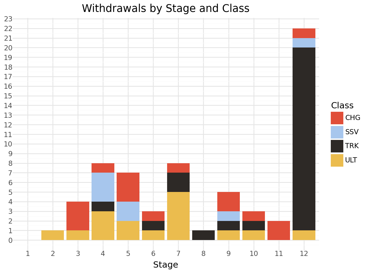
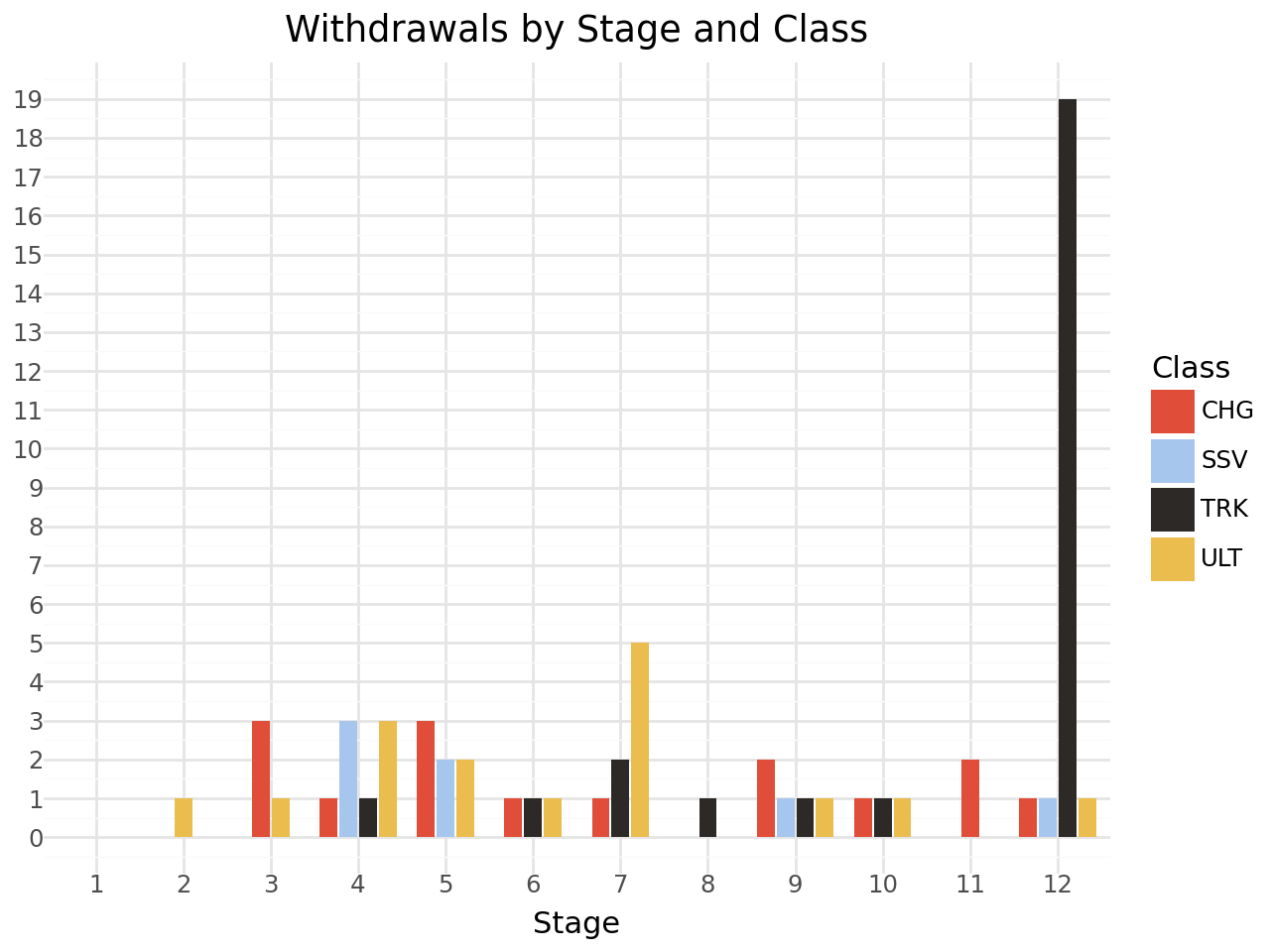
I find that sort of chart quite confusing. I find it much more readable if we dodge the bars rather than stack them:
from plotnine import position_dodge2

(
    ggplot(withdrawals_df, aes(x='stage', fill='tinyLabel', group='tinyLabel'))
    # Dodge groups bars
    # We also want the bars to have a preserved width
    + geom_bar(position=position_dodge2(width=0.9, preserve="single"))
    + theme_minimal()
    + scale_x_discrete(
        # Treat 'stage' as a categorical variable
        # while keeping the order of integers
        # Ensure 'stage' is treated in order
        limits=sorted(range(1, withdrawals_df['stage'].max()+1))
    )
    # The color is given in the data
    + scale_fill_manual(values=color_map)
    + scale_y_continuous(
        # Force integer ticks for the y-axis
        breaks=lambda l: range(0, int(l[-1])+1, 1)
    )
    + theme_minimal()
    + labs(
        title="Withdrawals by Stage and Class",
        x="Stage",
        y="",
        fill="Class"
    )
)